Nextjs Project Dashboard 01
https://nextjs.org/learn/dashboard-app
Overview
Here's an overview of features you'll learn about in this course:
- Styling: The different ways to style your application in Next.js.
- Optimizations: How to optimize images, links, and fonts.
- Routing: How to create nested layouts and pages using file-system routing.
- Data Fetching: How to set up a database on Vercel, and best practices for fetching and streaming.
- Search and Pagination: How to implement search and pagination using URL Search Params.
- Mutating Data: How to mutate data using React Server Actions, and revalidate the Next.js cache.
- Error Handling: How to handle general and
404not found errors. - Form Validation and Accessibility: How to do server-side form validation and tips for improving accessibility.
- Authentication: How to add authentication to your application using
NextAuth.jsand Middleware. - Metadata: How to add metadata and prepare your application for social sharing.
1) Getting Started
https://nextjs.org/learn/dashboard-app/getting-started
- create the project based on a template
npx create-next-app@latest nextjs-dashboard --example "https://github.com/vercel/next-learn/tree/main/dashboard/starter-example"
This command uses create-next-app, a Command Line Interface (CLI) tool that sets up a Next.js application for you.
Exploring the project
folder structure
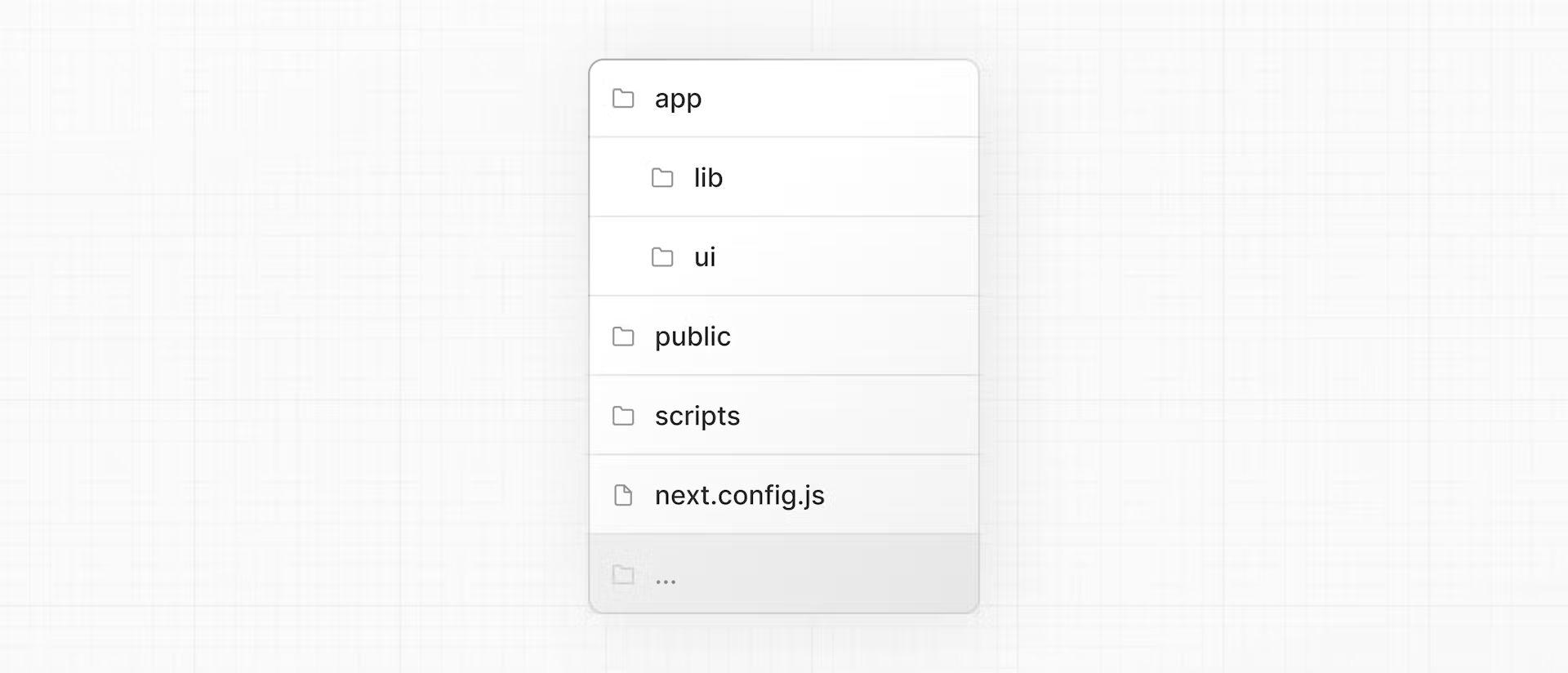
/app: Contains all the routes, components, and logic for your application, this is where you'll be mostly working from./app/lib: Contains functions used in your application, such as reusable utility functions and data fetching functions./app/ui: Contains all the UI components for your application, such as cards, tables, and forms. To save time, we've pre-styled these components for you./public: Contains all the static assets for your application, such as images./scripts: Contains a seeding script that you'll use to populate your database in a later chapter.- Config Files: You'll also notice config files such as
next.config.jsat the root of your application. Most of these files are created and pre-configured when you start a new project usingcreate-next-app. You will not need to modify them in this course.
Placeholder data
When you're building user interfaces, it helps to have some placeholder data. If a database or API is not yet available, you can:
- Use placeholder data in JSON format or as JavaScript objects.
- Use a 3rd party service like mockAPI.
For this project, we've provided some placeholder data in app/lib/placeholder-data.js. Each JavaScript object in the file represents a table in your database.
TypeScript
You may also notice most files have a .ts or .tsx suffix. This is because the project is written in TypeScript.
By using TypeScript, you can ensure you don't accidentally pass the wrong data format to your components or database, like passing a string instead of a number to invoice amount.
We're manually declaring the data types, but for better type-safety, we recommend Prisma, which automatically generates types based on your database schema.
Running the development server
install
pnpm i
start development server
pnpm dev
pnpm dev starts your Next.js development server on port 3000. You can optionally use npm or your preferred package manager instead of pnpm.
2) CSS Styling
Our targets:
- How to add a global CSS file to your application.
- Two different ways of styling: Tailwind and CSS modules.
- How to conditionally add class names with the
clsxutility package.
Global styles
If you look inside the /app/ui folder, you'll see a file called global.css
You can import global.css in any component in your application, but it's usually good practice to add it to your top-level component. In Next.js, this is the root layout (more on this later).
Add global styles to your application by navigating to /app/layout.tsx and importing the global.css file:
import '@/app/ui/global.css'; //<--- here

export default function RootLayout({
  children,
}: {
  children: React.ReactNode;
}) {
  return (
    <html lang="en">
      <body>{children}</body>
    </html>
  );
}
If you take a look inside global.css, you'll notice some @tailwind directives:
@tailwind base;
@tailwind components;
@tailwind utilities;
Tailwind
https://nextjs.org/docs/app/building-your-application/styling/tailwind-css
Tailwind is a CSS framework that speeds up the development process by allowing you to quickly write utility classes directly in your TSX markup.
In Tailwind, you style elements by adding class names. For example, adding the class "text-blue-500" will turn the <h1> text blue:
<h1 className="text-blue-500">I'm blue!</h1>
Let's play with Tailwind! Copy the code below and paste it above the <p> element in /app/page.tsx:
<div
  className="h-0 w-0 border-b-[30px] border-l-[20px] border-r-[20px] border-b-black border-l-transparent border-r-transparent"
/>
CSS Modules
Inside /app/ui, create a new file called home.module.css and add the following CSS rules:
.shape {
  height: 0;
  width: 0;
  border-bottom: 30px solid black;
  border-left: 20px solid transparent;
  border-right: 20px solid transparent;
}
Then, inside your /app/page.tsx file import the styles and replace the Tailwind class names from the <div> you've added with styles.shape:
import AcmeLogo from '@/app/ui/acme-logo';
import { ArrowRightIcon } from '@heroicons/react/24/outline';
import Link from 'next/link';
import styles from '@/app/ui/home.module.css';

export default function Page() {
  return (
    <main className="flex min-h-screen flex-col p-6">
      <div className={styles.shape} />
    // ...
  )
}
Tailwind and CSS modules are the two most common ways of styling Next.js applications. Whether you use one or the other is a matter of preference - you can even use both in the same application!
Using the clsx library to toggle class names: Conditionally Style
clsx is a library that lets you toggle class names easily. We recommend taking a look at documentation for more details, but here's the basic usage:
- Suppose that you want to create an
InvoiceStatuscomponent which acceptsstatus. The status can be'pending'or'paid'. - If it's
'paid', you want the color to be green. If it's'pending', you want the color to be gray.
You can use clsx to conditionally apply the classes, like this:
import clsx from 'clsx';

export default function InvoiceStatus({ status }: { status: string }) {
  return (
    <span
      className={clsx(
        'inline-flex items-center rounded-full px-2 py-1 text-sm',
        {
          'bg-gray-100 text-gray-500': status === 'pending',
          'bg-green-500 text-white': status === 'paid',
        },
      )}
    >
    // ...
)}
3) Optimizing Fonts and Images
- How to add custom fonts with
next/font. - How to add images with
next/image. - How fonts and images are optimized in Next.js.
Why optimize fonts?
Fonts play a significant role in the design of a website, but using custom fonts in your project can affect performance if the font files need to be fetched and loaded.
Cumulative Layout Shift is a metric used by Google to evaluate the performance and user experience of a website.
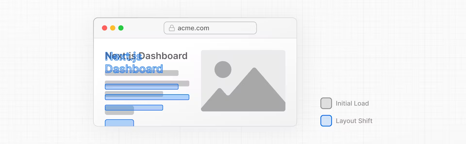
Next.js automatically optimizes fonts in the application when you use the next/font module. It downloads font files at build time and hosts them with your other static assets. This means when a user visits your application, there are no additional network requests for fonts which would impact performance.
Adding a primary font
In your /app/ui folder, create a new file called fonts.ts.
Import the Inter font from the next/font/google module - this will be your primary font. Then, specify what subset you'd like to load. In this case, 'latin':
import { Inter } from 'next/font/google';

export const inter = Inter({ subsets: ['latin'] });
Finally, add the font to the <body> element in /app/layout.tsx:
By adding Inter to the <body> element, the font will be applied throughout your application. Here, you're also adding the Tailwind antialiased class which smooths out the font. It's not necessary to use this class, but it adds a nice touch.
import '@/app/ui/global.css';
import { inter } from '@/app/ui/fonts';

export default function RootLayout({
  children,
}: {
  children: React.ReactNode;
}) {
  return (
    <html lang="en">
      <body className={`${inter.className} antialiased`}>{children}</body>
    </html>
  );
}
Practice: Adding a secondary font
Now it's your turn! In your fonts.ts file, import a secondary font called Lusitana and pass it to the <p> element in your /app/page.tsx file. In addition to specifying a subset like you did before, you'll also need to specify the font weight.
二级字体的意思
<p className={`${pixelifySans.className} text-xl text-gray-800 md:text-3xl md:leading-normal`}>
Why optimize images?
With regular HTML, you would add an image as follows:
- Ensure your image is responsive on different screen sizes.
- Specify image sizes for different devices.
- Prevent layout shift as the images load.
- Lazy load images that are outside the user's viewport.
Image Optimization is a large topic in web development that could be considered a specialization in itself. Instead of manually implementing these optimizations, you can use the next/image component to automatically optimize your images.
The <Image> component
The <Image> Component is an extension of the HTML <img> tag, and comes with automatic image optimization, such as:
- Preventing layout shift automatically when images are loading.
- Resizing images to avoid shipping large images to devices with a smaller viewport.
- Lazy loading images by default (images load as they enter the viewport).
- Serving images in modern formats, like WebP and AVIF, when the browser supports it.
Adding the desktop hero image
Let's use the <Image> component. If you look inside the /public folder, you'll see there are two images: hero-desktop.png and hero-mobile.png.
import AcmeLogo from '@/app/ui/acme-logo';
import { ArrowRightIcon } from '@heroicons/react/24/outline';
import Link from 'next/link';
import { lusitana } from '@/app/ui/fonts';
import Image from 'next/image';

export default function Page() {
  return (
    // ...
    <div className="flex items-center justify-center p-6 md:w-3/5 md:px-28 md:py-12">
      {/* Add Hero Images Here */}
      <Image
        src="/hero-desktop.png"
        width={1000}
        height={760}
        className="hidden md:block"
        alt="Screenshots of the dashboard project showing desktop version"
      />
    </div>
    //...
  );
}
Here, you're setting the width to 1000 and height to 760 pixels. It's good practice to set the width and height of your images to avoid layout shift, these should be an aspect ratio identical to the source image.
You'll also notice the class hidden to remove the image from the DOM on mobile screens, and md:block to show the image on desktop screens.
Practice: Adding the mobile hero image
Under the image you've just added, add another <Image> component for hero-mobile.png.
- The image should have a
widthof560andheightof620pixels. - It should be shown on mobile screens, and hidden on desktop - you can use dev tools to check if the desktop and mobile images are swapped correctly.
block:使元素在所有屏幕尺寸上默认显示为块级元素。在 CSS 中,
block是一个常用的显示(display)属性值,它将元素设为块级元素。块级元素的特点是:
- 独占一行:块级元素通常会占据其父容器的整个宽度,并独占一行。换句话说,块级元素会自动换行到下一行。
- 宽度自动填充:默认情况下,块级元素的宽度会自动填充其父容器的宽度,除非你明确指定了它的宽度。
- 高度自动调整:块级元素的高度会根据其内容自动调整。
使用
block可以让内联元素(如<span>、<a>等)表现得像块级元素。常见的块级元素包括<div>、<p>、h1-h6等。在使用 Tailwind CSS 这样的实用优先的 CSS 框架时,
md是指中等(medium)屏幕尺寸的断点。Tailwind CSS 中的断点用于创建响应式设计,具体如下:
sm:表示小屏幕(small),最小宽度通常是 640px。md:表示中等屏幕(medium),最小宽度通常是 768px。lg:表示大屏幕(large),最小宽度通常是 1024px。xl:表示超大屏幕(extra large),最小宽度通常是 1280px。2xl:表示超超大屏幕(2 extra large),最小宽度通常是 1536px。
md:hidden意味着在中等及更大屏幕上隐藏元素(768px 及更大)。
md:block意味着在中等及更大屏幕上显示为块级元素(768px 及更大)。
所以 className="block md:hidden" 意思是在中等及更大屏幕上隐藏元素,其他的显示为块级元素
3) Creating Layouts and Pages
- Create the
dashboardroutes using file-system routing. - Understand the role of folders and files when creating new route segments.
- Create a nested layout that can be shared between multiple dashboard pages.
- Understand what colocation, partial rendering, and the root layout are.
Nested routing
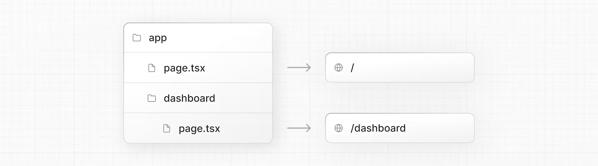
Next.js uses file-system routing where folders are used to create nested routes. Each folder represents a route segment that maps to a URL segment.
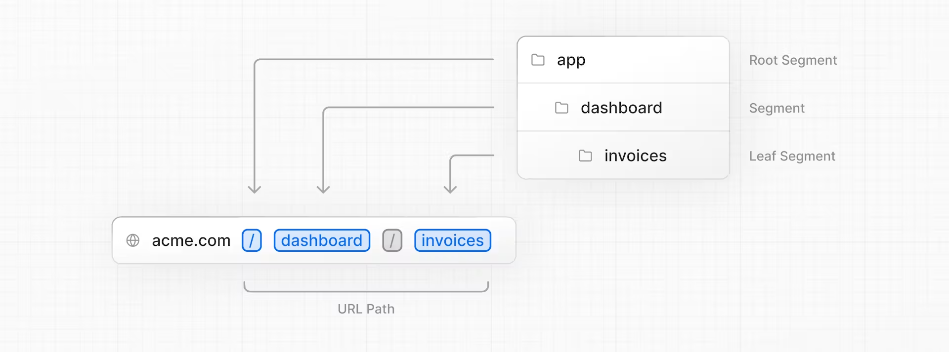
You can create separate UIs for each route using layout.tsx and page.tsx files.
You can create separate UIs for each route using layout.tsx and page.tsx files.
page.tsx is a special Next.js file that exports a React component, and it's required for the route to be accessible. In your application, you already have a page file: /app/page.tsx - this is the home page associated with the route /.
To create a nested route, you can nest folders inside each other and add page.tsx files inside them. For example:
Creating the dashboard page
Create a new folder called dashboard inside /app. Then, create a new page.tsx file inside the dashboard folder with the following content:
export default function Page() {
  return <p>Dashboard Page</p>;
}
Now, make sure that the development server is running and visit http://localhost:3000/dashboard. You should see the "Dashboard Page" text.
Colocate: 也就是允许把 UI 组件,css,测试文件同时放在 app 底下,路由只能访问 page.tsx 的内容
By having a special name for
pagefiles, Next.js allows you to colocate UI components, test files, and other related code with your routes. Only the content inside thepagefile will be publicly accessible. For example, the/uiand/libfolders are colocated inside the/appfolder along with your routes.
Practice: Creating the dashboard pages
- Customers Page: The page should be accessible on http://localhost:3000/dashboard/customers. For now, it should return a
<p>Customers Page</p>element. - Invoices Page: The invoices page should be accessible on http://localhost:3000/dashboard/invoices. For now, also return a
<p>Invoices Page</p>element.
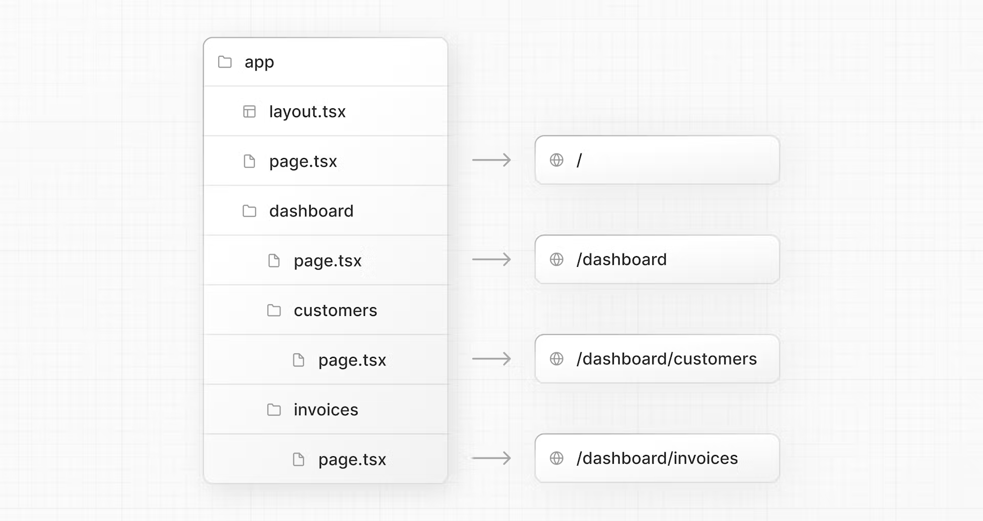
Creating the dashboard layout
Dashboards have some sort of navigation that is shared across multiple pages.
Inside the /dashboard folder, add a new file called layout.tsx and paste the following code:
import SideNav from '@/app/ui/dashboard/sidenav';

export default function Layout({ children }: { children: React.ReactNode }) {
  return (
    <div className="flex h-screen flex-col md:flex-row md:overflow-hidden">
      <div className="w-full flex-none md:w-64">
        <SideNav />
      </div>
      <div className="flex-grow p-6 md:overflow-y-auto md:p-12">{children}</div>
    </div>
  );
}
First, you're importing the <SideNav /> component into your layout. Any components you import into this file will be part of the layout.
The <Layout /> component receives a children prop. This child can either be a page or another layout. In your case, the pages inside /dashboard will automatically be nested inside a <Layout /> like so:
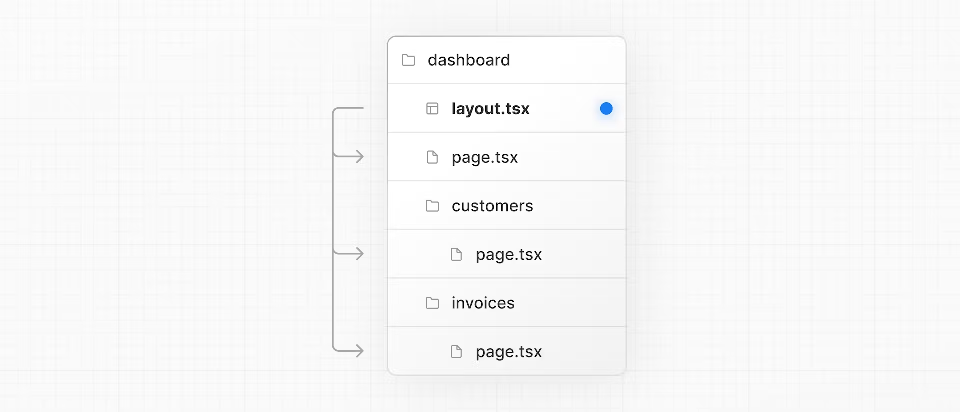
One benefit of using layouts in Next.js is that on navigation, only the page components update while the layout won't re-render. This is called partial rendering:

Root layout
In Chapter 3, you imported the Inter font into another layout: /app/layout.tsx. As a reminder:
import '@/app/ui/global.css';
import { inter } from '@/app/ui/fonts';

export default function RootLayout({
  children,
}: {
  children: React.ReactNode;  // 组件接受一个 children 属性,其类型定义为 React.ReactNode。
}) {
  return (
    <html lang="en">
      <body className={`${inter.className} antialiased`}>{children}</body>
    </html>
  );
}
This is called a root layout and is required. Any UI you add to the root layout will be shared across all pages in your application. You can use the root layout to modify your <html> and <body> tags, and add metadata (you'll learn more about metadata in a later chapter).
Navigating Between Pages
- How to use the
next/linkcomponent. - How to show an active link with the
usePathname()hook. - How navigation works in Next.js.